Iconoclasm
When I bought my first PC in 1984, the salesperson cautioned me that I wouldn’t be able to use it right away. It was missing an essential component — something called a “disk operating system” — which was required for the computer to do any computing. The operating system (more succinctly known as DOS) came on a floppy disk, which was backordered and expected to arrive in a few days. In the meantime, all I could do was play the computer’s demo disk, designed to show off its capabilities on the showroom floor, over and over and over.
Despite that annoyance, once I learned to use DOS, I quickly became a fan. I loved the simple elegance of the C:\> prompt with the flashing cursor, patiently waiting for me to type in a command. But my romance with DOS was doomed. The same year I bought my PC, Apple introduced the Macintosh, with a graphical user interface that allowed users to do much of their work simply by clicking or dragging with a mouse. I dismissed the Mac as a toy — something that was appealing to beginners, but not suitable for serious work — and assumed that it would be a passing fad. Instead, it was quickly and widely accepted as the model for what a desktop computer ought to be.
My friend Brad, an early advocate of graphical interfaces, urged me to come aboard. He said that the Macintosh’s intuitive way of doing things represented the future of computing.
“On the contrary,” I said, “it’s like going back to the Stone Age. Back then, if you wanted to refer to something, you had to point to it. That was inefficient. That’s why we invented language.”
“But it’s easy to make mistakes when you type in commands,” he insisted.
“And it’s just as easy to make mistakes if you’re not good at handling a mouse,” I said, having had that experience in my experiments with using one.
Once I accepted that change was inevitable, I dodged Microsoft’s weak replacement for DOS, called Windows, by switching to a Macintosh. I’ve had nothing but Macs for 40 years now, and I confess that I’ve come to like using a mouse. But one consequence of that industrywide switch from words to pictures that drives me crazy is the need for everything to be represented by a visual symbol, whether useful or not.
The original Mac icons were simple and clear. For example, in the very first version of Photoshop, it was easy to grasp that ![]() denoted a brush,
denoted a brush, ![]() denoted a pencil, and
denoted a pencil, and ![]() denoted an eraser. But as Photoshop became more sophisticated and more features were added, providing an immediately recognizable icon became next to impossible.
denoted an eraser. But as Photoshop became more sophisticated and more features were added, providing an immediately recognizable icon became next to impossible.
For example, how would you visually represent the Content-Aware Move Tool (which allows you to move a selection from one place to another, with Photoshop magically repairing the place it was moved from), or the 3D Material Drop Tool (which allows you to sample the surface texture of a 3D object and apply it to another 3D object)? The answers are ![]() and
and ![]() respectively, but I wouldn’t have been able to tell you that without looking them up first. I find most icons in current programs to be completely useless, such that I usually have to ignore them entirely and just roll over them to see their names pop up.
respectively, but I wouldn’t have been able to tell you that without looking them up first. I find most icons in current programs to be completely useless, such that I usually have to ignore them entirely and just roll over them to see their names pop up.
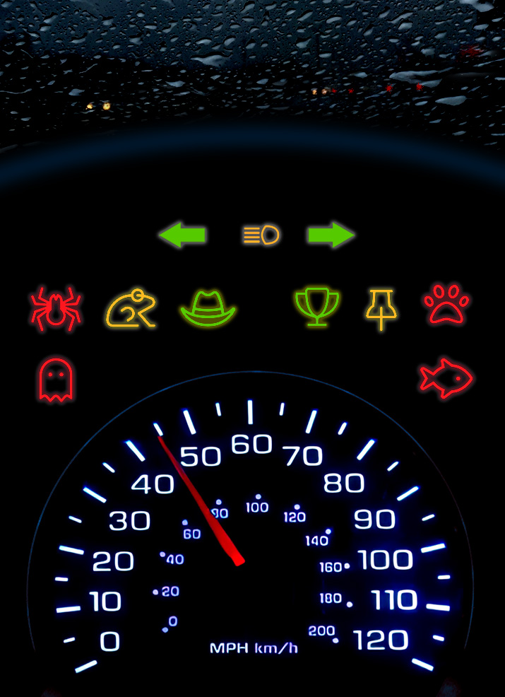
At least the Mac interface offers a quick way to see the words that define an icon. That’s not true in other environments that have been gradually overtaken by symbols. For example, I recently found myself driving a rental car with “idiot lights” that were identified solely by icons. The most puzzling was a picture of a car ( ![]() ) that suddenly illuminated on the dashboard. What could it possibly have been trying to tell me? I already knew that I was in a car. And frustratingly, there was no way to get any further information without pulling over to look in the owner’s manual.
) that suddenly illuminated on the dashboard. What could it possibly have been trying to tell me? I already knew that I was in a car. And frustratingly, there was no way to get any further information without pulling over to look in the owner’s manual.
Relatively certain that I wasn’t in the midst of an emergency, I waited until I got home to look it up, at which point I found out that the icon meant that there was a car in front of me. (I’m so glad that that the manufacturer thought to provide that warning — otherwise, I might have had to, you know, look through the windshield.) But even granting that the alert was useful, wouldn’t it have been even more useful if it consisted of the words “Car ahead”?
I seem to remember that prior to the age of icons, car dashboards used to display the warnings “Check Engine” and “Check Oil.” I don’t know about you, but when I look at the pictures that have supplanted them, I see a meat grinder ( ![]() ) and a genie’s lamp (
) and a genie’s lamp ( ![]() ). This, I still maintain, is why we invented language.
). This, I still maintain, is why we invented language.
I am in total agreement with you! I also hate contextual menus and the symbols used to represent them which also mean absolutely nothing to me. I find myself clicking seemingly at random trying to figure out where the thing that can help me can be found.