Long Gone
“Why does traditional lettering have serifs?” I would ask my design students, as an introduction to our unit on typography. “Who first had the idea to decorate alphabetic characters with little hats and shoes? Why go through the extra work?”
Most students had no answer, not ever having considered the issue. A few would cite studies purporting to show that serif typefaces enable faster reading than sans-serif typefaces — something about the serifs giving the eye a more obvious line to follow. (Even if there are such studies, they’d offer no evidence about how serifs came to exist in the first place.)
As it turns out, I was asking a trick question. My question assumed that unadorned letterforms came first, and that serifs were a flourish that was added later. In reality, serifs were there from the beginning. It’s only in relatively recent times, when efficiency became valued above all, that designers deliberately went about removing them.
Serifs are a relic of the calligrapher’s pen, from the time when all writing was done by hand. Although they had some practical value in managing the ink flow from a quill pen, serifs persisted, and became more refined, because they made the text beautiful. As most calligraphy was done by monks who were copying religious texts, the role of writing was not simply to convey information; it was to glorify the word of God. Beauty was part of the job.
Our attitude that utility is primary, and that beauty is an optional add-on, is a historical anomaly. For most of human history, it was assumed that if something was worth bringing into the world, then it either was inherently beautiful or deserved to be made beautiful. Beauty and truth, to paraphrase Keats, were indistinguishable from each other.
As unlikely as it may seem, what all this leads up to is the story of an 18th-century British carpenter-turned-clockmaker named John Harrison, who singlehandedly revolutionized marine navigation. Great Britain, you see, had an empire to rule; administering that empire required a fleet of ships; and each of those ships needed to know exactly where it was on any given day. Calculating a ship’s latitude was easy; it merely required measuring the distance from the sun to the horizon at midday. But calculating a ship’s longitude was next to impossible.
While latitude is measured in relation to the equator, longitude must be measured in relation to an arbitrary reference location — in this case, the Prime Meridian, which in 1721 had been established to pass through the Royal Observatory in Greenwich. Unlike the equator, whose position is fixed, meridians of longitude move with the rotation of the earth. Therefore, calculating a ship’s longitude required making precise observations of the positions of stars and planets, and comparing them to where an almanac predicted that they ought to be at specific places and times. That was not a very dependable method, especially since making accurate astronomical observations was hopelessly tricky aboard a rocking ship under an often cloud-covered sky.
In theory, all of this messiness could be dispensed with if a ship had a clock that continuously displayed the current time at the Prime Meridian. Then it would be simple to calculate the ship’s longitude by comparing that reference time with the local time. But the only type of clock that could theoretically maintain the required level of accuracy — one driven by a relatively new invention called the pendulum — was practically useless aboard ship, since the rocking of the ship and constant changes in temperature and humidity caused unacceptable variations in the pendulum’s motion. No clock had ever been made that could keep time reliably on a sea voyage.
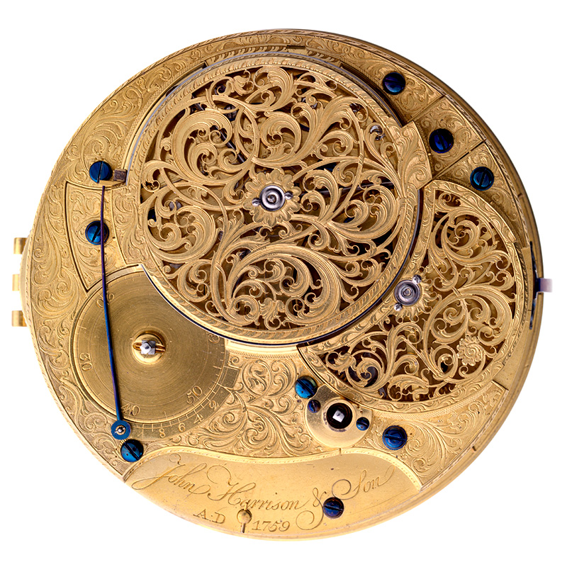
Harrison — given the incentive of a £20,000 reward that the British Parliament had offered to anyone who could create a dependable marine clock — set out to solve the problem, pairing impeccable craftsmanship with an uncanny ability to invent new technologies as needed. He spent five years developing his first sea clock, now known as H1, which maintained unprecedented (if not yet sufficient) accuracy on its test voyage. He spent another five years creating H2, and then an astounding 17 years completing H3, before starting from scratch on an entirely new design — resembling a large pocket watch rather than a standing clock — that six years later became H4. That model, completed in 1759, proved so accurate that it is credited as having forever changed the nature of sea travel.
All four of those clocks are now on exhibit in Greenwich, and all but the last are still running. (H4 remains in working condition, but is too delicate to be kept in continuous use while on display.) Debra and I visited the Royal Observatory just for the touristy fun of being able to straddle the Prime Meridian, with one foot in the Western Hemisphere and one in the Eastern, but I had no idea that our visit would also include an opportunity to view Harrison’s historic clocks.
The experience was astonishing — not just because these clocks so improbably still survive, but because they are so achingly, breathtakingly beautiful. Some of the beauty is inherent in their engineering: The precise machining and flawless polish that are necessary to their functioning, and the perfect discipline of their movement, are as soul-satisfying as any piece of art could ever be. But beyond that, Harrison — whose background was in fine cabinetry, and who sang with (and later led) his church choir — clearly did all he could to make the aesthetic appeal of his clocks commensurate with their scientific and historical importance.
Not only do all four timepieces have elegant faces engraved with delicate scrollwork; H4 goes so far as to save its most exquisite ornamentation for inside the watch case, which only the person who wound or maintained the device would ever get to see. Every tiny element of the mechanism reflects profound thought and meticulous care (some of which was provided by other skilled craftsmen whom Harrison hired to do the work).
Harrison’s clocks did not have to be attractive to qualify for the £20,000 reward; they only had to work. But Harrison evidently knew what the designers of early typefaces had known — that any physical manifestation of truth must also be beautiful. The only other influential person in recent times that I can think of who knew this was Steve Jobs. Are there others?


I can’t point knowledgeably at particular people, because they are not areas I follow, but the language of physics, mathematics, astronomy, microbiology, etc. suggests that the scientists in those fields do indeed get that beauty is integral to truth. The elegant proof, the beautiful mind, the sense of deep awe…. Perhaps to see it, it’s necessary to move a step or several from the world of monetization, efficiency, etc. Frank Wilczek comes to mind, Margaret Wertheim as well. Neither a household name so perhaps not meeting your ‘influential’ test in a broad sense, but both certainly influential in their fields. What do you think?
I love this post and so grateful that you have shared this history lesson with me. I value beauty so much and creating it takes time and care. It’s one of the reasons I find what comedians and story tellers put up on social media platforms so disturbing with their sloppy editing and ugly graphics. We are living in an age of “fast fashion” in which everything falls apart quickly and then goes to the landfill. I would describe what gets spewed onto Instagram and TikTok as “fast entertainment.” There’s nothing enduring about it. Let’s hear it for Slow Art and Slow Everything for that matter.