
It’s always puzzled me — and, if I’m going to be honest, troubled me — that no one ever comments on, or even seems to notice, the images that accompany these blog posts. A few of them (generally, the ones that are captioned) are actual photos of actual things, but the rest are painstaking handiworks that may take more time to create than the essays that accompany them. Most of them can be clicked on to be viewed at a larger size. (The exceptions are the animated ones, such as the one displayed here, which would take much too long to display at a higher resolution.)
Back when I first entered the media business, when I was still producing filmstrips and slideshows rather than videos, I was hugely frustrated by my inability to manipulate images — particularly 35-millimeter slides, which were the medium of choice for both audiovisual and print publishing. Whatever the camera photographed was what the slide displayed. It was possible to make a color print of a slide, alter it with ink or paint or pieces of other images, and then rephotograph it, but the result always looked flat and phony. Most of the time, I just had to live with my own helplessness.
I should note that I was never very effective in a production environment — my forte has always been post-production. If I hired a scriptwriter, I could rarely describe exactly what I was looking for (often because I didn’t know exactly what I was looking for), so I would take whatever the writer gave me and end up rewriting it myself. If I was directing a recording session with a voiceover artist, I often had trouble getting the talent to read a line the way I wanted it read; instead, I would edit the tape later, cutting together words and syllables from different takes to get the desired result. I longed for the freedom to do the same thing with images.
Moving into video in the 1980s gave me some of that freedom. It was easy to color-correct footage, superimpose one image on another, or juxtapose them by means of split screens. It was even possible to place people or things in different backgrounds through the chromakey process, which involved shooting against a brightly lit blue or green screen. But shooting chromakey footage was expensive, since it required renting a studio, and the resulting composite — which in those days was achieved through fairly primitive electronics — never looked convincing.
My world changed with the emergence of digital photography and digital video around the end of the last century. Photoshop, the industry-standard image-editing program, was created in 1988 and began to be widely distributed in the early 1990s. Although I had a good Macintosh computer by then, I couldn’t afford genuine Photoshop software, so I bought a cheap knockoff called Color It!, which lacked many of Photoshop’s more advanced capabilities but was otherwise powerful and reliable.
My big breakthrough came when I was working on a fundraising video for Catholic Charities of San Francisco. They had a prized photo of the pope’s visit to the city in 1987, and wanted it included in the video, but there was a problem: The large head of a bald priest, with his back to the camera, was prominent in the foreground. Could I do anything about it? I wasn’t sure, but I scanned the photo, brought it into Color It!, and began to play around with the available tools. I discovered that by selectively copying and pasting bits of the surrounding area, I was able to completely and convincingly obliterate the offending pate. That was my start as a photo manipulator.
By the time I could afford the real Photoshop, I was already pretty skilled at retouching, restoration, and compositing. With the acquisition of another (now sadly obsolete) program called DeBabelizer — a little-known, professional-grade, automated editing program with an impenetrable interface — I was able to transfer those skills to video. Eventually I graduated to full video editing and motion graphics using software such as Premiere Pro and After Effects, and teaching community-college students how to use these kinds of software.
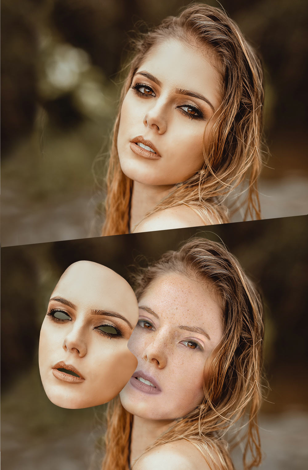
Although I’m technically retired, I still do a lot of (mostly volunteer) photo and video editing for a variety of clients. When I’m not doing that, I’m writing and illustrating this blog. My blog illustrations, even the ones that look fairly simple, are assembled from bits and pieces of multiple stock photos. (For example, in the recent image of LBJ riding a tortoise, the president’s right hand actually comes from Vladimir Putin’s infamous bare-chested horseback snapshot.) More complicated images, such as the one of the nonconforming sheep from mid-2021, may comprise dozens of separate elements.
In the world of musical theater, there are some songs that make sense only in the context of a show, and others that can stand alone. The latter are the ones that have a chance of becoming popular. I try, when possible, to make images that can have meaning outside of the blog posts they accompany, and therefore might somehow qualify as art. Most of the time, though, they can only be considered illustrations, since they make sense only if you’ve read the post.
I take solace in the fact that Stephen Sondheim rarely wrote a song that could stand alone — the only exception I can think of is “Send in the Clowns” — and yet is still acknowledged as a master of his craft. I’m far from a Stephen Sondheim, but I’d like to think that some of the images I create might make a difference for somebody, if only to provide a few minutes’ enjoyment.
Recent Comments